- Have any Query ?
- +91-7008562317
- +91-9438140285
- webmaster@sitsindia.co.in
Mastering Flexbox: A Guide to Modern Website Layouts

In the realm of web design, CSS Flexbox has emerged as a transformative tool for creating dynamic, responsive layouts. Flexbox, short for Flexible Box Module, is a layout model that allows space distribution between items in an interface and powerful alignment capabilities. This guide will explore the basics of Flexbox, its core concepts, and practical applications in web design.
Understanding Flexbox
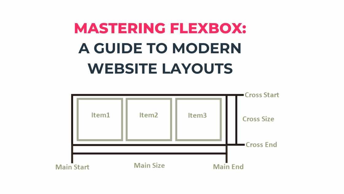
Flexbox is designed to provide a more efficient way to lay out, align, and distribute space among items in a container, even when their size is unknown or dynamic. The main idea behind Flexbox is to give the container the ability to alter its items’ width/height (and order) to best fill the available space (mostly to accommodate to all kind of display devices and screen sizes). Flexbox is direction-agnostic as opposed to the regular layouts (block which is vertically-based and inline which is horizontally-based).
Core Components of Flexbox
- Flex Container: The parent element that you apply display: flex to. It becomes a flex container, and its children become flex items.
- Flex Items: The children of a flex container.
Properties of the Flex Container
- display: This defines a flex container. Set this to flex or inline-flex.
- flex-direction: This establishes the main-axis, thus defining the direction flex items are placed in the flex container. It can be row, row-reverse, column, or column-reverse.
- flex-wrap: By default, flex items will all try to fit onto one line. You can change that and allow the items to wrap as needed with this property.
- justify-content: This defines the alignment along the main axis and can help distribute extra free space leftover when either all the flex items on a line are inflexible or are flexible but have reached their maximum size.
- align-items: This defines the default behavior for how flex items are laid out along the cross axis on the current line.
- align-content: This aligns a flex container’s lines within the flex container when there is extra space in the cross-axis.
Properties of Flex Items
- flex-grow: This defines the ability for a flex item to grow if necessary.
- flex-shrink: This defines the ability for a flex item to shrink if necessary.
- flex-basis: This defines the default size of an element before the remaining space is distributed.
- flex: This is a shorthand for flex-grow, flex-shrink, and flex-basis combined.
- order: This defines the order in which a flex item appears in the flex container.
Practical Examples
To see Flexbox in action, consider a simple layout scenario: a navigation bar with links. Normally, spacing these links evenly or positioning them centrally can be a hassle with traditional CSS methods, but Flexbox simplifies the process immensely.
<div style="display: flex; justify-content: space-around; align-items: center;">

<a href="#">Home</a>

<a href="#">About</a>

<a href="#">Services</a>

<a href="#">Contact</a>

</div>
In this example, display: flex initiates Flexbox for the container, justify-content: space-around distributes space around each link, and align-items: center vertically aligns the links in the middle of the container.
Conclusion
Flexbox is a powerful, flexible tool that can handle a variety of layout tasks that were cumbersome with older CSS properties. It’s widely supported in all modern browsers, making it an essential tool for front-end developers. As more designers embrace responsive design principles, understanding and using Flexbox is crucial for creating sophisticated layouts that work across different devices.
Flexbox is not only about convenience but also about rethinking layout logic from the ground up. It offers a new level of flexibility and control, enabling designers and developers to craft aesthetically pleasing and functionally robust layouts.


